To me there are two aspects to data communication: aesthetics and functionality. Aesthetics is obvious, it’s the visual appeal of a graphic, but functionality is less obvious. Graphics have a functional purpose, which is to highlight patterns and trends in data in a visual way. A graphic is functionally successful when it is easy to understand the patterns in the data. This seems arbitrary, but in fact it can be quantified-- you can measure the time it takes someone to process different graphical representations of the same data set. From this, you can derive principles that lead to graphics that have high functional value, or short interpretation times. For more info, read Tufte (on the Iridescent reading list!).
Given my background, I’m of course approaching the issue as a scientist, and as you might guess, science is almost entirely concerned with graphic functionality. Scientists are commonly working with extremely complex and inter-related data sets, and determining patterns from such data can be tricky. Using default graphics options can lead to visual clutter when dealing with complex data, and so many scientists take a lot of care in thinking how to present their data in ways that highlights the patterns they wish to emphasize. That being said, scientists place little care in aesthetics, often providing very ugly, but easy to understand graphics.
This is something I cared a lot about in grad school. I felt that someone’s ability to understand my data and take something away from my presentation was highly dependent on my ability to present that data clearly. I could have done an absolutely stellar research project, but with poor visuals few people would be able to understand or appreciate what I had done, so I put a lot of time into understanding data visualizations. (This desire to have people understand research is not common to all scientists-- some just want to do really interesting research and could care less how many other people know about it). I took several courses in science communication, had a great advisor and fellow grad students who gave great data visualization feedback, read a lot of Tufte, made science posters with Ioana, and still spend a lot of time learning how to use data visualization tools like R and Illustrator. Anyways, I don’t always nail it, but I try to do the best I can in finding the best functional way to present data.
That being said, I have very little understanding of aesthetics. I still cringe when I look at outfits I picked out for myself as a kid in old pictures, I’ve always had a horrible color sense. What this means is that I might do a really good job figuring out what elements of a graph should all be the same color to aide pattern recognition, but choose a god-awful color to represent them.
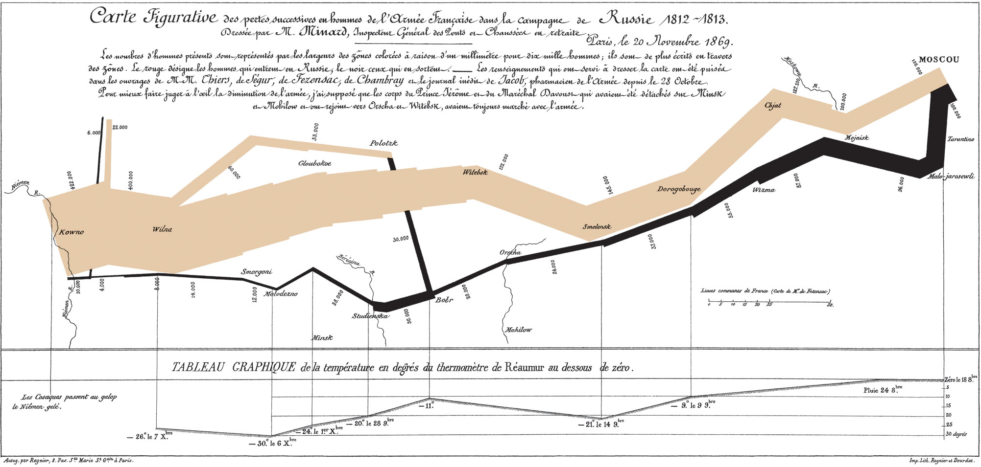
But is there a conflict between an aesthetically pretty graphic and a functionally useful graphic? Not necessarily, and I can certainly think of graphics that do both effectively, like Napolean’s march:


.JPG)