Juan Rubio, the Digital Media and Learning Program Manager at the Seattle Public Library (SPL), designs, develops, and manages educational technology programs with digital media, such as games, interactive storytelling, virtual reality experiences, and augmented reality narratives. He is the author of the chapter, Working Together: Youth-Adult Partnerships to Enhance Youth Voice, in YALSA’s new book, Putting Teens First in Library Services: A Roadmap. He is on the board of directors of Filmmakers without Borders. Mr. Rubio is also a short story writer.
KM: Ok, so I really want to talk to you about some of the summer programming you ran at Globalkids that used digital badges. Can you start by describing your previous role at Globalkids?
JR: I was a Director for the Digital Leadership Learning (former OLP). I was responsible for managing programs around the city teaching digital skills such as game design, programming, and interactive storytelling. The programs took place at a different locations and types of institutions such as New York Public Schools in the Bronx, Queens, and Brooklyn. Some of them also took place at other informal spaces such as NYSCI, AMNH, Brooklyn Museum, etc. Part of the responsibilities also included securing funds and collaborations with partners. For example, the iDesign program was a NSF funded project in collaboration with Hofstra University and Public Schools in Long Island, NY. http://dllglobalkids.weebly.com/blog/archives/07-2014
KM: Let’s talk about the summer programs run in 2012. Can you describe the system of badges you used in Virtual Video Project and Race to the White House?
Tuesday, October 8, 2019

Monday, August 26, 2019
Failing at immersion: fancy play buttons
Have you ever experienced a fancy play button? You know what I mean. Its that experience where you are wrapped up in an interesting tale, and the natural ebb and flow of the story is stopped because.. you have to click play again. This annoyance usually runs by the name of "engagement," as if giving a viewer something, anything, to do will make a passive experience transform into something that has engagement. It's especially concerning when it comes to "VR," and we see things fly under the flag of immersion which are really just even fancier play buttons.
Wednesday, August 21, 2019
Rewards Structures in The Ward Game: An interview with Paul Darvasi
As the second interview in this series, I am excited to interview Paul Darvasi, who is a high school English and Media Studies teacher who teaches at Royal St. George’s College, in Toronto, Canada. Paul is also a doctoral candidate at York University, and a founding member of the Play Lab at the University of Toronto. He researches, writes, and speaks at the intersections of games, culture, society, education, and learning. He also designs pervasive or alternate reality games which he has implemented in instructional settings, and one of those games will be the focus of today's interview.
KM: So I’m excited to talk about the very first time I heard you talk about your classroom. It was at the Games for Education conference in Troy, and you talked about what you did with One Flew Over the Cuckoo’s Nest. Could you provide a brief description of that game here?
PD: Essentially, I used the narrative, setting, theme, and characters from Ken Kesey’s novel to create a 30-day game where my students are immersed in the world of the asylum. I was struck that so many of Kesey’s critiques about Nurse Ratched’s ward, such as the use of authority, coercion, and clockwork organization coincided with some of the worst aspects of schooling.
KM: So I’m excited to talk about the very first time I heard you talk about your classroom. It was at the Games for Education conference in Troy, and you talked about what you did with One Flew Over the Cuckoo’s Nest. Could you provide a brief description of that game here?
PD: Essentially, I used the narrative, setting, theme, and characters from Ken Kesey’s novel to create a 30-day game where my students are immersed in the world of the asylum. I was struck that so many of Kesey’s critiques about Nurse Ratched’s ward, such as the use of authority, coercion, and clockwork organization coincided with some of the worst aspects of schooling.
Friday, February 8, 2019
Reward structures in Gamestar Mechanic: An interview with Scott Price
Today, I’m excited to interview a close colleague and friend, Scott Price. Scott has been helping people play and learn online and offline for over 15 years. After teaching for several years, he entered the game industry with Scholastic and then joined the pioneering studio Gamelab. He moved back into "educational" games with Gamestar Mechanic, the groundbreaking game about game design, which will be the focus of today’s interview. Scott has had QA, IT, Creative, Project and Product Management roles, and has spoken on production, game design, and education at several dozen conferences and events. Scott is now Director of Product with BrainPOP.
I have previously talked about the idea of rewards in games on this blog, as well as intrinsic rewards in specific. This interview is one of several I hope to have over the next year, as I attempt to connect ideas written on this blog to real world work that others have done.
KM: Ok, so I really want to talk to you about Gamestar Mechanic, a project I know you worked on several years ago. Maybe to start, you can describe briefly what Gamestar Mechanic is for those that aren’t familiar?
SP: Sure! Gamestar Mechanic is an online game and community that teaches game design and systems thinking through gameplay and design. Players follow a steampunk Quest and play 2D platforming and top-down games, eventually hitting levels that they can’t beat.
Wednesday, December 20, 2017
Playing Megaman with your Mom
 |
| Cover Art for Mega Man 2, from Wikipedia. Copyright by Capcom. |
“I’m going to play Mega Man now.”
“Ok, I’ll be free in 15 min.”
I distinctly remember this conversation from my childhood. This conversation was normal in many ways, I was a Nintendo child through and through. I was born the same year that Nintendo was released. I remember seeing the “1984” date etched in the plastic console and thinking, “Yes, this was made for me.”
And Mega Man 2, well, it was just one of those games that stuck with you. It was one of the originators of the classic Capcom formula: play a level, face a boss, get the boss’s special powers after beating them. Of course Mega Man 2 wasn’t the original or the last Mega Man, but it was the one that hooked me as a kid, so it was assumed that anytime I said I was “playing Mega Man,” it was Mega Man 2. This was normal.
But there’s a lot about the exchange that isn’t normal.
Friday, October 6, 2017
The subjective nature of truth
As a scientist, I've spent a lot of time concerning myself with how to convey scientific facts to those outside the scientific community. As a concerned U.S. citizen in the last 9 months, I've spent time trying to figure out what are the political facts of this world and how we trust them. As an educator, I'm particularly interested in how we teach our children to recognize true facts from false ones.
I think I've learned two simple concepts about fact-finding that I want to share. First, as humans, we don't trust facts as being true because the evidence is credible, but rather because we believe the source of the evidence is credible. Second, our default mode as humans is be extremely subjective about how we process information about the world.
I remember being taught about this subject in school.
I think I've learned two simple concepts about fact-finding that I want to share. First, as humans, we don't trust facts as being true because the evidence is credible, but rather because we believe the source of the evidence is credible. Second, our default mode as humans is be extremely subjective about how we process information about the world.
I remember being taught about this subject in school.
Wednesday, August 9, 2017
What is Immersion and does VR own it?
"Virtual Reality is great because it's so immersive." A common tagline nowadays that grates my ears every time I hear it. It implies that Virtual Reality, or VR, has some kind of special hold on the idea of Immersion. Some people have backed away from this claim recently, offered the more palatable claims of "a sense of presence," but having just walked out of the 2017 Games For Change day on VR, I can say immersion is still going strong.
I have two issues with this phrase-
I have two issues with this phrase-
Wednesday, June 1, 2016
Should we teach simple things first?
In my time volunteering and working for Iridescent, I came to understand a certain model for how to teach design processes. Having read the Common Core and Next Generation Science Standards, I realized that the Iridescent model of teaching is unique from the more typical and common sense teaching models, but that difference is really powerful. I'd call this model core-first teaching, and I believe it's particularly applicable to teaching topics like engineering design, coding, or the scientific method.
Tuesday, February 16, 2016
A nuanced look at Student Data Privacy
Student data privacy is a big concern with the proliferation of data in education. But is all data equally concerning? We tend to put all “Student Data” in one big bucket and treat it as if it’s all the same. Yet we know there are drastic differences between different schools and EdTech companies in their mission, approach, pedagogy and tools: is it really reasonable to suspect that all of their data is the same? And more importantly is all data and uses of that data equally threatening from a student privacy standpoint?
I’ll give away the punchline- my answer is no, not all student data is equal. But if it’s not all equal, what criteria can we use to distinguish student data? Here’s some ideas.
Monday, October 19, 2015
Intrinsic rewards and grinding in video games
In one of my earliest blog posts, I talked about my model for intrinsic rewards in video games. The basic idea is that many games create a loop, such when you follow the loop the reward for an action is being able to do that action more, and in a more challenging way. Do something to do that thing more is an intrinsic reward: do something to get something else is an extrinsic reward. Seems simple, but gets really messy when applied to different game genres, and my recent experience with Fallout Shelter made me realize this needs a deeper look. This blog post will talk through how intrinsic rewards play out in different games, in particular how they are related to the issue of grinding and meaningful gameplay.

Friday, March 13, 2015
Bloom's taxonomy in NGSS (part 3/3)
This article is cross-posted on the BrainPOP Educator blog.
Inspired by Dan Meyer's analysis, I wrote two previous posts on the Common Core Math and Common Core ELA standards. Both broke down the standards on a task by task basis, and coded each task according to Bloom's taxonomy. In this part 3, we're going to turn to the NGSS and see how it ranks up.
In addition to coding the specific NGSS grade bands (which are shown on the left of both graphs), I also decided to code the framework itself (the right side of both graphs). The Framework was comprehensive enough to be able to separately code the tasks in each of the Framework's three components: 1) the Science and Engineering Practices, 2) the Crosscutting Concepts, and 3) the Disciplinary Core Ideas (I did break up the DCI by grades). Of course, the components are not expected to be taught in isolation even though I am coding them this way, but it is interesting to note differences in each component. The top graph shows the number of tasks, and the bottom shows the same info by percentages.


First, general patterns. Unsurprisingly, the total number of tasks goes up with grade. Second, there is a slight trend towards higher level skills at higher grades (though it's not nearly as strong as the ELA standards). Third, the Framework's components are very similar to what might be expected. The DCIs are unsurprisingly focused mostly on remember tasks. The Practices, on the other hand, emphasize a fair proportion of tasks across the spectrum. The Crosscutting Concepts most emphasize analyze tasks.
The most interesting patterns involve the gradebands, and their comparison to the Framework. The gradebands show a clear preference for higher level skills, for all grades. Create tasks start as early as kindergarten, and persist through high school. The main pattern across grades is that Remember tasks (primarily making observations) is strongest in kindergarten and fades in later grades. The most striking feature of the gradebands is that they most closely resemble the Science and Engineering Practices in their distribution of tasks. In other words, the Framework claims that the Practices are suppose to underlie all of the gradeband standards, and that seems to hold out surprisingly well. This is an especially interesting comparison to the CC Mathematical Practices, whose distribution of tasks carried little resemblance to the gradebands themselves. The traditional conception of science as a collection of facts is shown in the DCI's, but does not reflect itself in the gradebands.
The NGSS are certainly setting a high bar for what they expect from students in terms of science performance in school, and according to this analysis the bar sits at a higher level of Bloom's taxonomy than either Common Core standard.
That's it, part 3 of 3! Please, let me know your thoughts in the comments below.
Some grade-specific standards contained multiple parts, or multiple tasks that they required from students. I coded each "task" required from students, which usually was one per standard, but sometimes was multiple tasks per standard.
For the gradebands, I coded the "performance expectations," or the things that followed "Students who demonstrate understanding can:"
For the Framework, I had to be a little more creative. For the Science and Engineering Practices, each practice has a section entitled "Goals" that starts with the phrase "By grade 12, students should be able to" and had a series of bullet points. I coded each of those bullet points. For the Crosscutting Concepts, I coded the short description of each concept on page 84 of the Framework. There was a section labelled "Progression" which described how the treatment of the concepts would change over time, but it was hard to code a clear number of tasks from that description. This led to a small number of total tasks, but a reliable relative percentage of tasks. For the Disciplinary Core Ideas, I coded the "Grade Band Endpoints," which were subdivided into 4 categories for different grade level. This again produced a somewhat artificially high number of tasks, as each sentence from a several paragraph description was coded separately, but the relative proportions are reliable.
Each gradeband started with a verb that was relatively clearly related to some level of blooms, and allow for easy, direct coding. The only sequence that I had to interpret a bit was "Developing a model to..." This most resembled a create task, especially when the thing being modeled is sufficiently complex and there are multiple potential ways to model it. But when the model was relatively simple and defined (like the water cycle), this felt much more like an analyze task- just finding and sorting all the obvious and finite pieces, rather than creating or synthesizing something new and novel from a large and complex assemblage of parts. I used my best judgement to distinguish between Analyze and Create for that verb sequence.
Inspired by Dan Meyer's analysis, I wrote two previous posts on the Common Core Math and Common Core ELA standards. Both broke down the standards on a task by task basis, and coded each task according to Bloom's taxonomy. In this part 3, we're going to turn to the NGSS and see how it ranks up.
Next Generation Science Standards
First, general patterns. Unsurprisingly, the total number of tasks goes up with grade. Second, there is a slight trend towards higher level skills at higher grades (though it's not nearly as strong as the ELA standards). Third, the Framework's components are very similar to what might be expected. The DCIs are unsurprisingly focused mostly on remember tasks. The Practices, on the other hand, emphasize a fair proportion of tasks across the spectrum. The Crosscutting Concepts most emphasize analyze tasks.
The most interesting patterns involve the gradebands, and their comparison to the Framework. The gradebands show a clear preference for higher level skills, for all grades. Create tasks start as early as kindergarten, and persist through high school. The main pattern across grades is that Remember tasks (primarily making observations) is strongest in kindergarten and fades in later grades. The most striking feature of the gradebands is that they most closely resemble the Science and Engineering Practices in their distribution of tasks. In other words, the Framework claims that the Practices are suppose to underlie all of the gradeband standards, and that seems to hold out surprisingly well. This is an especially interesting comparison to the CC Mathematical Practices, whose distribution of tasks carried little resemblance to the gradebands themselves. The traditional conception of science as a collection of facts is shown in the DCI's, but does not reflect itself in the gradebands.
The NGSS are certainly setting a high bar for what they expect from students in terms of science performance in school, and according to this analysis the bar sits at a higher level of Bloom's taxonomy than either Common Core standard.
That's it, part 3 of 3! Please, let me know your thoughts in the comments below.
Notes on Methodology
In case you are curious how I did this analysis, here some details.Some grade-specific standards contained multiple parts, or multiple tasks that they required from students. I coded each "task" required from students, which usually was one per standard, but sometimes was multiple tasks per standard.
For the gradebands, I coded the "performance expectations," or the things that followed "Students who demonstrate understanding can:"
For the Framework, I had to be a little more creative. For the Science and Engineering Practices, each practice has a section entitled "Goals" that starts with the phrase "By grade 12, students should be able to" and had a series of bullet points. I coded each of those bullet points. For the Crosscutting Concepts, I coded the short description of each concept on page 84 of the Framework. There was a section labelled "Progression" which described how the treatment of the concepts would change over time, but it was hard to code a clear number of tasks from that description. This led to a small number of total tasks, but a reliable relative percentage of tasks. For the Disciplinary Core Ideas, I coded the "Grade Band Endpoints," which were subdivided into 4 categories for different grade level. This again produced a somewhat artificially high number of tasks, as each sentence from a several paragraph description was coded separately, but the relative proportions are reliable.
Each gradeband started with a verb that was relatively clearly related to some level of blooms, and allow for easy, direct coding. The only sequence that I had to interpret a bit was "Developing a model to..." This most resembled a create task, especially when the thing being modeled is sufficiently complex and there are multiple potential ways to model it. But when the model was relatively simple and defined (like the water cycle), this felt much more like an analyze task- just finding and sorting all the obvious and finite pieces, rather than creating or synthesizing something new and novel from a large and complex assemblage of parts. I used my best judgement to distinguish between Analyze and Create for that verb sequence.
Wednesday, March 4, 2015
Bloom's taxonomy in Common Core ELA (part 2/3)
This article is cross-posted on the BrainPOP Educator blog.
In the last blog post, I was inspired by Dan Meyer's technique and broke the Common Core in discrete tasks, grouped by Bloom's taxonomy. In this part 2, I'm continuing the analysis and looking at the Common Core ELA. Part 3, including the NGSS, is up next!
So why such a difference between Math and ELA? It might have to do with the different nature of the subjects. Math is a series of inter-related but discrete topics. Each grade introduces new topics, with new vocabulary and techniques that require scaffolding. ELA, on the other hand, is a relatively small set of skills (reading, writing, listening, speaking), all of which are practiced at all grade levels. What changes is how those skills are expected to be practiced.
UPDATE- You can also check out Part 3 of this series.
Some grade-specific standards contained multiple parts, or multiple tasks that they required from students. I coded each "task" required from students, which usually was one per standard, but sometimes was multiple tasks per standard.
The standards themselves note that they are overlapping, in that the same content is emphasized and described in different ways in multiple standards. By my analysis, this would give those kinds of semi-repeated tasks more weight, as they would be counted multiple times for each of the various places they appeared. I decided this was ok- things that were more crucial tended to be more often repeated, and therefore should get more weight.
The ELA standards were often very repetitive across grades. Higher grades would often require the same task, but in a more rigorous way. Typically some kind of adjective or adverb would be added to the sentence to describe exactly how the rigor was suppose to be added. For my purposes, making the task more "rigorous" by adding an adjective or adverb qualifier did not change how I coded the task.
In the last blog post, I was inspired by Dan Meyer's technique and broke the Common Core in discrete tasks, grouped by Bloom's taxonomy. In this part 2, I'm continuing the analysis and looking at the Common Core ELA. Part 3, including the NGSS, is up next!
Common Core ELA
So, what the Common Core ELA standards. Once again the top figure shows the percentage of tasks in each level of Bloom's taxonomy, whereas the lower graph shows pure numbers of standards.


The ELA standards have a very different story from the Math standards [link]. The number of tasks does increase with higher grade levels, but not as sharply as the math standards do. On the other hand, there is a clear progression towards higher level skills at higher grades. Analyze tasks become important from grade 3 onwards, and Evaluate tasks become important from grade 7 onwards. Understanding is a an important task between grades 2-6, but then starts to disappear from 6 grade onwards in favor of more Analyze and Evaluate tasks. In general, in higher grades simple comprehension is not enough- one is expected to not only comprehend but to compare and place texts in larger contexts.So why such a difference between Math and ELA? It might have to do with the different nature of the subjects. Math is a series of inter-related but discrete topics. Each grade introduces new topics, with new vocabulary and techniques that require scaffolding. ELA, on the other hand, is a relatively small set of skills (reading, writing, listening, speaking), all of which are practiced at all grade levels. What changes is how those skills are expected to be practiced.
UPDATE- You can also check out Part 3 of this series.
Notes on Methodology
In case you are curious how I did this analysis, here some details.Some grade-specific standards contained multiple parts, or multiple tasks that they required from students. I coded each "task" required from students, which usually was one per standard, but sometimes was multiple tasks per standard.
The standards themselves note that they are overlapping, in that the same content is emphasized and described in different ways in multiple standards. By my analysis, this would give those kinds of semi-repeated tasks more weight, as they would be counted multiple times for each of the various places they appeared. I decided this was ok- things that were more crucial tended to be more often repeated, and therefore should get more weight.
The ELA standards were often very repetitive across grades. Higher grades would often require the same task, but in a more rigorous way. Typically some kind of adjective or adverb would be added to the sentence to describe exactly how the rigor was suppose to be added. For my purposes, making the task more "rigorous" by adding an adjective or adverb qualifier did not change how I coded the task.
Monday, February 23, 2015
Bloom's taxonomy in the Common Core Math (part 1/3)
This article is cross-posted on the BrainPOP Educator blog.
Recently, Dan Meyer posted an analysis of what kinds of tasks are expected of students on the Khan Academy and how it compared to the Common Core. Dan used a recently released sample test from the SBAC to describe what the Common Core required, but we were inspired to take Dan's analysis one step further. Instead of interpreting SBAC's interpretation of the Common Core's interpretation of what students should do, we decided to go right to the core, the Common Core. What exact kind of tasks is the Common Core requiring of students? And how do those requirements change across grades?
But, we needed a categorization system to group different kinds of student tasks. Dan used verbs to categorize tasks, but some verbs actually call for similar mental processes, and so probably should be grouped together rather than separated. Additionally some verbs in the standards, like "understand" can have loaded meanings and depending on their context refer to higher or lower order cognitive tasks. To accommodate both of these issues, we grouped tasks using everyone's favorite categorization system, Bloom's taxonomy.
So, this lead to a relatively large task, of going through every standard in every grade and tagging it with one or more levels of Bloom's taxonomy. Our hope is that by doing this kind of work, we can better understand what kind of tasks the Common Core is emphasizing. In this blog post, I'll look at the Common Core Math standards, look for the CCELA and NGSS in followup posts!
Another qualification- the Mathematical Practices are much more weighted towards high level tasks than the standards themselves as can be seen in the top figure, and these practices are meant to be infused across the grade level standards. Exactly how this infusing should occur is not clear, but that certainly would weight the scale towards higher level tasks.
UPDATE- You can also check out Part 2 and Part 3 of this series.
Some grade-specific standards contained multiple parts, or multiple tasks that they required from students. I coded each "task" required from students, which usually was one per standard, but sometimes was multiple tasks per standard.
The standards themselves note that they are overlapping, in that the same content is emphasized and described in different ways in multiple standards. By my analysis, this would give those kinds of semi-repeated tasks more weight, as they would be counted multiple times for each of the various places they appeared. I decided this was ok- things that were more crucial tended to be more often repeated, and therefore should get more weight.
The high school Math standards were not broken up by grade, they were broken up by subject. I felt they confused the graph more than added useful info, so I did not show them here. But I can say that the high school standards were similar to the middle school standards in mostly emphasizing lower order skills in similar percentages.
To refer back to the original point of Dan's article- the sample test released by the SBAC seems to be testing at a much, much higher level than the 8th grade Common Core standards seem to be calling for, potentially indicating that they had selectively released their best test items, and that the sample test is not a representative example of the test as a whole. Also, the Khan Academy is actually doing quite well compared to the standards themselves! If anything, the Khan Academy tasks were at a higher average level of Bloom's taxonomy than the tasks described in 8th grade Common Core Math standards.
Recently, Dan Meyer posted an analysis of what kinds of tasks are expected of students on the Khan Academy and how it compared to the Common Core. Dan used a recently released sample test from the SBAC to describe what the Common Core required, but we were inspired to take Dan's analysis one step further. Instead of interpreting SBAC's interpretation of the Common Core's interpretation of what students should do, we decided to go right to the core, the Common Core. What exact kind of tasks is the Common Core requiring of students? And how do those requirements change across grades?
But, we needed a categorization system to group different kinds of student tasks. Dan used verbs to categorize tasks, but some verbs actually call for similar mental processes, and so probably should be grouped together rather than separated. Additionally some verbs in the standards, like "understand" can have loaded meanings and depending on their context refer to higher or lower order cognitive tasks. To accommodate both of these issues, we grouped tasks using everyone's favorite categorization system, Bloom's taxonomy.
So, this lead to a relatively large task, of going through every standard in every grade and tagging it with one or more levels of Bloom's taxonomy. Our hope is that by doing this kind of work, we can better understand what kind of tasks the Common Core is emphasizing. In this blog post, I'll look at the Common Core Math standards, look for the CCELA and NGSS in followup posts!
Common Core Math
First up, Common Core Math! The results are shown in the two figures below. The top figure shows the percentage of tasks in each level of Bloom's taxonomy, where the lower graph shows pure numbers. The first column in the bottom graph codes the "Mathematical Practices," which are intended to span across all standards, across all grades.


The first two things to notice are that the number of tasks required of students increases with each grade level, and that the distribution of tasks does not change much across grade levels. There is a transition between grades 3-4, in which there are less Understand and more Apply tasks. But in general, there is very little trend across grades. Additionally, for most grades the highest three levels of the taxonomy compromise only 10-35% of the total tasks. For the majority of mathematics tasks students are being asked to do, those tasks are at a relatively low level on Blooms. To be fair, the higher level tasks do take more time than low level tasks, so the allotment of classroom time will be more weighted towards higher level tasks than these standards indicate. But the majority of the standards text actually describe relatively low level tasks.Another qualification- the Mathematical Practices are much more weighted towards high level tasks than the standards themselves as can be seen in the top figure, and these practices are meant to be infused across the grade level standards. Exactly how this infusing should occur is not clear, but that certainly would weight the scale towards higher level tasks.
UPDATE- You can also check out Part 2 and Part 3 of this series.
Notes on Methodology
In case you are curious how I did this analysis, here some details.Some grade-specific standards contained multiple parts, or multiple tasks that they required from students. I coded each "task" required from students, which usually was one per standard, but sometimes was multiple tasks per standard.
The standards themselves note that they are overlapping, in that the same content is emphasized and described in different ways in multiple standards. By my analysis, this would give those kinds of semi-repeated tasks more weight, as they would be counted multiple times for each of the various places they appeared. I decided this was ok- things that were more crucial tended to be more often repeated, and therefore should get more weight.
The high school Math standards were not broken up by grade, they were broken up by subject. I felt they confused the graph more than added useful info, so I did not show them here. But I can say that the high school standards were similar to the middle school standards in mostly emphasizing lower order skills in similar percentages.
To refer back to the original point of Dan's article- the sample test released by the SBAC seems to be testing at a much, much higher level than the 8th grade Common Core standards seem to be calling for, potentially indicating that they had selectively released their best test items, and that the sample test is not a representative example of the test as a whole. Also, the Khan Academy is actually doing quite well compared to the standards themselves! If anything, the Khan Academy tasks were at a higher average level of Bloom's taxonomy than the tasks described in 8th grade Common Core Math standards.
Wednesday, December 10, 2014
Possible educational value of using phones in schools
Today, I had a very enjoyable conversation with Dr. Kate Highfield about the roles of technology in early education. I've always been frustrated by school technology use in the US- we complain about not having the funds to support a 1-1 technology to student ratio in classrooms, but then spend countless amounts of time and energy preventing kids from brings cell phones into the classroom. We live in a world in which we are close to 1-1 people to technology ratio, and then we ban that technology from schools, and then try to recreate that 1-1 ratio from scratch. Which is why I was very intrigued when Dr. Highfield described how common the BYOD (Bring Your Own Device) policy was in Australian schools.
Putting aside the utility of greater student connectivity, could there potentially be other benefits to letting students use their phone in the classroom? Hear me out for a second. In my work at Iridescent, I found a real value to giving families in our family science program piles of unsorted household supplies to build their machines with. You can give nice fabricated or branded pieces, or "kits" of carefully measured out proportions of household materials, but either of those options tends to give the impression that you need the "nice" stuff or the "kit" to do science, and leads to less making things after the program ends. Nothing beats a random pile of unsorted household materials for giving someone the confidence to do science on their own, at home.
So would the same thinking apply to technology devices? Consider that whatever we do with phones in school, kids are going to be on their phones when they leave school. Wouldn't it be great if kids were spending that phone time on more productive, learning activities? It might be that using a school technology device, like a labtop or a tablet with some preloaded software, gives kids the impression that they need the "technology kit" to learn on their technology device. Maybe they will think that they need the school's computer that has been specifically specced out for learning apps, or the actual pre-installed applications, to really learn on some technology. Maybe they'll see that they can do some of the same stuff on their home computers, if they have one. But, on their phones? What if students actually needed to use their phones in school, in order to view and later use their phones as learning tools?
So here's my question to Dr. Highfield and anyone else- has anyone researched this issue, particularly in a place like Australia where a BYOD policy exists? Does the type of technology used by students in school affect how those same students use their personal technology devices outside of school?
Putting aside the utility of greater student connectivity, could there potentially be other benefits to letting students use their phone in the classroom? Hear me out for a second. In my work at Iridescent, I found a real value to giving families in our family science program piles of unsorted household supplies to build their machines with. You can give nice fabricated or branded pieces, or "kits" of carefully measured out proportions of household materials, but either of those options tends to give the impression that you need the "nice" stuff or the "kit" to do science, and leads to less making things after the program ends. Nothing beats a random pile of unsorted household materials for giving someone the confidence to do science on their own, at home.
So would the same thinking apply to technology devices? Consider that whatever we do with phones in school, kids are going to be on their phones when they leave school. Wouldn't it be great if kids were spending that phone time on more productive, learning activities? It might be that using a school technology device, like a labtop or a tablet with some preloaded software, gives kids the impression that they need the "technology kit" to learn on their technology device. Maybe they will think that they need the school's computer that has been specifically specced out for learning apps, or the actual pre-installed applications, to really learn on some technology. Maybe they'll see that they can do some of the same stuff on their home computers, if they have one. But, on their phones? What if students actually needed to use their phones in school, in order to view and later use their phones as learning tools?
So here's my question to Dr. Highfield and anyone else- has anyone researched this issue, particularly in a place like Australia where a BYOD policy exists? Does the type of technology used by students in school affect how those same students use their personal technology devices outside of school?
Thursday, December 4, 2014
The Four Freedoms of Play and Common Core Standardized Testing
This article is cross-posted on the Iridescent blog.

I was inspired by Scot Osterweil's recent presentation at GLS, in which he presented his four freedoms of play:
I was inspired by Scot Osterweil's recent presentation at GLS, in which he presented his four freedoms of play:
- Freedom to Experiment
- Freedom to Fail
- Freedom to Try on Identifies
- Freedom of Effort
What makes this framework most interesting is that to Scot, these are not only the four freedoms of play, but also the four freedoms of learning. Good learning environments also need to contain these freedoms to be effective, an idea very much resonant with James Gee's view on games and learning.
Although these freedoms are not a particularly new idea, it was new to me this year, and it really helped crystalize several previous thoughts I've written about. It definitely resonated with my ideas that agency is not a binary quality of an activity, but that learning activities can contain different degrees of agency. This framework helped illuminate some of those different degrees to which an activity can contain freedom/agency.
Although these freedoms are not a particularly new idea, it was new to me this year, and it really helped crystalize several previous thoughts I've written about. It definitely resonated with my ideas that agency is not a binary quality of an activity, but that learning activities can contain different degrees of agency. This framework helped illuminate some of those different degrees to which an activity can contain freedom/agency.
But most interestingly, Scot noted in his talk how school doesn't contain these freedoms, despite the fact that both games and learning do. His challenge to us was to imagine a school environment that did contain these freedoms. I found it especially interesting to think about in relation to Common Core and standardized testing, which led to the question of this blog post: could a school environment that was constrained by standards ever achieve these four freedoms? Let's try to break down the freedoms and answer that question.
Monday, December 1, 2014
Homemade device to record your iPad with your iPhone using popsicle sticks and rubber bands
This article is cross-posted on the Iridescent blog.

So at Iridescent, we like to live what we preach. We don't just ask kids to make things from scratch, we do it too. Recently I decided that I needed a device to record myself playing games on my iPad (for a separate project to be talked about later). I had done this once before using my iPhone stacked up on a bunch of books and it worked reasonably well. So I decided I wanted the device to hold my iPhone in a position where it could record my iPad. But I also wanted to record myself consistently over the course of a year, so that each time I set it up, it recorded the same way, which meant I needed something better than the stacks-of-books method. It also had to be minimally intrusive in preventing me from using the iPad.
As I thought about this, I realized I had a well-defined design challenge that I needed to solve. Which meant to make things more fun, I decided to use the rule in we use in all of our design challenges: use only low-cost materials.
Additionally, I was always impressed with a Leonardo Da Vinci segment that Bobby Zacharias used in our Be an Inventor program in spring 2012. In the first weeks of that program, students had to design some kind of invention using only the tools and technology available to Leonardo. This meant no glue or machine screws could be used to make connections--things had to be lashed together or connected by pin joints. I always thought that sounded fun, so I decided to put the same constraint on my device.
So, where did that leave me? With a handful of popsicle sticks, rubber bands, and a bunch of ideas in my head.
So at Iridescent, we like to live what we preach. We don't just ask kids to make things from scratch, we do it too. Recently I decided that I needed a device to record myself playing games on my iPad (for a separate project to be talked about later). I had done this once before using my iPhone stacked up on a bunch of books and it worked reasonably well. So I decided I wanted the device to hold my iPhone in a position where it could record my iPad. But I also wanted to record myself consistently over the course of a year, so that each time I set it up, it recorded the same way, which meant I needed something better than the stacks-of-books method. It also had to be minimally intrusive in preventing me from using the iPad.
As I thought about this, I realized I had a well-defined design challenge that I needed to solve. Which meant to make things more fun, I decided to use the rule in we use in all of our design challenges: use only low-cost materials.
Additionally, I was always impressed with a Leonardo Da Vinci segment that Bobby Zacharias used in our Be an Inventor program in spring 2012. In the first weeks of that program, students had to design some kind of invention using only the tools and technology available to Leonardo. This meant no glue or machine screws could be used to make connections--things had to be lashed together or connected by pin joints. I always thought that sounded fun, so I decided to put the same constraint on my device.
So, where did that leave me? With a handful of popsicle sticks, rubber bands, and a bunch of ideas in my head.
 |
| The final result! Now, how did I get here... |
Thursday, November 13, 2014
5 Signals that an "Educational Game" Isn't Really a Game
This article is cross-posted on the Iridescent blog.

Kids love games, but why do they hate educational games? The short answer is that most aren't truly games, because being gamelike means a lot more than having flashy graphics and a point system. As an educational game developer, I think one of the most damaging aspects to this industry is when people call things games in order to get kids to play them when they clearly aren't games.
How can you spot the fake games masquerading as educational games? Here are a few signals I've picked up on over time.
1. When walking through a demo of the game, the game designer stops to say "And this part is where the learning occurs."
The learning should be everywhere, not in one part of the game. If you can compartmentalize the part of the game that is about learning, you did something wrong. One such example would be breaking up the game to show a player an instructional video- if you are using a video to teach, then you are not using the gameplay to teach.
How can you spot the fake games masquerading as educational games? Here are a few signals I've picked up on over time.
1. When walking through a demo of the game, the game designer stops to say "And this part is where the learning occurs."
The learning should be everywhere, not in one part of the game. If you can compartmentalize the part of the game that is about learning, you did something wrong. One such example would be breaking up the game to show a player an instructional video- if you are using a video to teach, then you are not using the gameplay to teach.
Monday, November 10, 2014
Function vs. Aesthetics in data visualization
This article is cross-posted on the Iridescent blog.
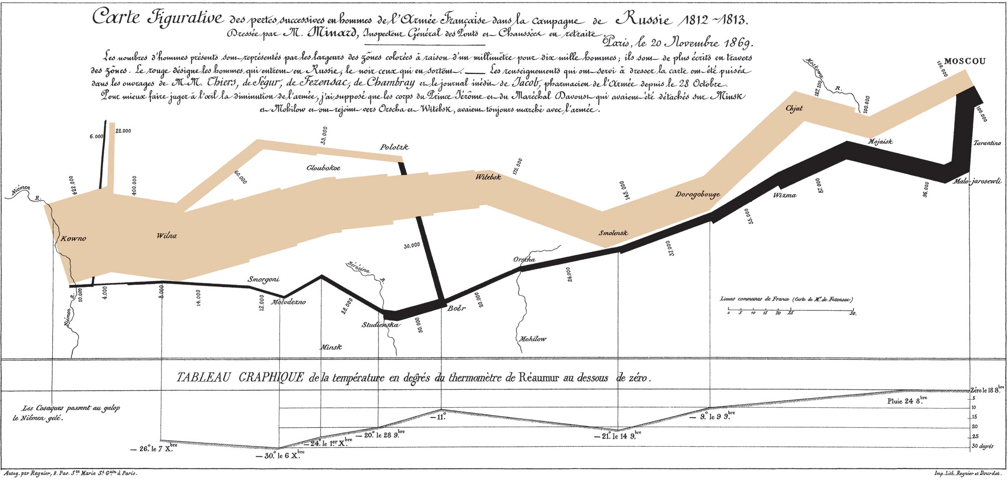
To me there are two aspects to data communication: aesthetics and functionality. Aesthetics is obvious, it’s the visual appeal of a graphic, but functionality is less obvious. Graphics have a functional purpose, which is to highlight patterns and trends in data in a visual way. A graphic is functionally successful when it is easy to understand the patterns in the data. This seems arbitrary, but in fact it can be quantified-- you can measure the time it takes someone to process different graphical representations of the same data set. From this, you can derive principles that lead to graphics that have high functional value, or short interpretation times. For more info, read Tufte (on the Iridescent reading list!).
Given my background, I’m of course approaching the issue as a scientist, and as you might guess, science is almost entirely concerned with graphic functionality. Scientists are commonly working with extremely complex and inter-related data sets, and determining patterns from such data can be tricky. Using default graphics options can lead to visual clutter when dealing with complex data, and so many scientists take a lot of care in thinking how to present their data in ways that highlights the patterns they wish to emphasize. That being said, scientists place little care in aesthetics, often providing very ugly, but easy to understand graphics.
This is something I cared a lot about in grad school. I felt that someone’s ability to understand my data and take something away from my presentation was highly dependent on my ability to present that data clearly. I could have done an absolutely stellar research project, but with poor visuals few people would be able to understand or appreciate what I had done, so I put a lot of time into understanding data visualizations. (This desire to have people understand research is not common to all scientists-- some just want to do really interesting research and could care less how many other people know about it). I took several courses in science communication, had a great advisor and fellow grad students who gave great data visualization feedback, read a lot of Tufte, made science posters with Ioana, and still spend a lot of time learning how to use data visualization tools like R and Illustrator. Anyways, I don’t always nail it, but I try to do the best I can in finding the best functional way to present data.
That being said, I have very little understanding of aesthetics. I still cringe when I look at outfits I picked out for myself as a kid in old pictures, I’ve always had a horrible color sense. What this means is that I might do a really good job figuring out what elements of a graph should all be the same color to aide pattern recognition, but choose a god-awful color to represent them.
But is there a conflict between an aesthetically pretty graphic and a functionally useful graphic? Not necessarily, and I can certainly think of graphics that do both effectively, like Napolean’s march:

To me there are two aspects to data communication: aesthetics and functionality. Aesthetics is obvious, it’s the visual appeal of a graphic, but functionality is less obvious. Graphics have a functional purpose, which is to highlight patterns and trends in data in a visual way. A graphic is functionally successful when it is easy to understand the patterns in the data. This seems arbitrary, but in fact it can be quantified-- you can measure the time it takes someone to process different graphical representations of the same data set. From this, you can derive principles that lead to graphics that have high functional value, or short interpretation times. For more info, read Tufte (on the Iridescent reading list!).
Given my background, I’m of course approaching the issue as a scientist, and as you might guess, science is almost entirely concerned with graphic functionality. Scientists are commonly working with extremely complex and inter-related data sets, and determining patterns from such data can be tricky. Using default graphics options can lead to visual clutter when dealing with complex data, and so many scientists take a lot of care in thinking how to present their data in ways that highlights the patterns they wish to emphasize. That being said, scientists place little care in aesthetics, often providing very ugly, but easy to understand graphics.
This is something I cared a lot about in grad school. I felt that someone’s ability to understand my data and take something away from my presentation was highly dependent on my ability to present that data clearly. I could have done an absolutely stellar research project, but with poor visuals few people would be able to understand or appreciate what I had done, so I put a lot of time into understanding data visualizations. (This desire to have people understand research is not common to all scientists-- some just want to do really interesting research and could care less how many other people know about it). I took several courses in science communication, had a great advisor and fellow grad students who gave great data visualization feedback, read a lot of Tufte, made science posters with Ioana, and still spend a lot of time learning how to use data visualization tools like R and Illustrator. Anyways, I don’t always nail it, but I try to do the best I can in finding the best functional way to present data.
That being said, I have very little understanding of aesthetics. I still cringe when I look at outfits I picked out for myself as a kid in old pictures, I’ve always had a horrible color sense. What this means is that I might do a really good job figuring out what elements of a graph should all be the same color to aide pattern recognition, but choose a god-awful color to represent them.
But is there a conflict between an aesthetically pretty graphic and a functionally useful graphic? Not necessarily, and I can certainly think of graphics that do both effectively, like Napolean’s march:
Tuesday, November 4, 2014
Similarities between Communism and the Common Core
This article is cross-posted on the Iridescent blog.
When I was on my high school debate team, we would discuss all kinds of philosophical principles "in theory." I remember several discussions about Communism in which the common tagline was: "It was a good idea in theory, too bad it didn't work in practice." That phrase always bothered me. To me, a good idea was something that worked. If something couldn't be put into practice, it just wasn't a good idea, in theory or practice.
Understanding human nature is a vital component to an idea being good. If you have an idea for how people should interact with each other, but that idea doesn't respect aspects of human nature and psychology, then it's just a plain bad idea. And that was the problem with Communism to me, it didn't respect how people work. It didn't respect our intrinsic needs for agency, competency, and ownership. If you are designing a solution for people, it has to work for people, it can't just be "good in theory," in some abstract, idealistic sense of the word.
More recently, I've come to understand a similar sentiment in Silicon Valley entrepreneurial world. Venture capitalists aren't just looking for a good idea. They are looking for someone who has a good team behind them and can lead them to success, someone who understands the market and how to reach users: in sum, they are looking for someone who understands people, both internally in building their team, and externally in getting users. Great ideas are a dime a dozen: great realizations of great ideas are rare gems worth funding. In other words, you can't get funding with a great idea in theory: you need to have a great idea in practice.
Now, let's shift to the Common Core. First a distinction- I want to distinguish between the Common Core framework, and the system of high stakes achievement tests used to determine whether students have passed the tests. Sidenote: by high stakes, I mean there are consequences for both students and for teachers based on the results of the tests- a low stakes test can evaluate how smart students are, but low and high scores have absolutely no consequences for students or teachers, they simply give feedback on how well the system is doing. When states "adopt" the Common Core, it typically means they adopt both of these things, they aren't just giving their teachers a new set of standards to teach, they are also implementing a system of high risk testing.
When I was on my high school debate team, we would discuss all kinds of philosophical principles "in theory." I remember several discussions about Communism in which the common tagline was: "It was a good idea in theory, too bad it didn't work in practice." That phrase always bothered me. To me, a good idea was something that worked. If something couldn't be put into practice, it just wasn't a good idea, in theory or practice.
Understanding human nature is a vital component to an idea being good. If you have an idea for how people should interact with each other, but that idea doesn't respect aspects of human nature and psychology, then it's just a plain bad idea. And that was the problem with Communism to me, it didn't respect how people work. It didn't respect our intrinsic needs for agency, competency, and ownership. If you are designing a solution for people, it has to work for people, it can't just be "good in theory," in some abstract, idealistic sense of the word.
More recently, I've come to understand a similar sentiment in Silicon Valley entrepreneurial world. Venture capitalists aren't just looking for a good idea. They are looking for someone who has a good team behind them and can lead them to success, someone who understands the market and how to reach users: in sum, they are looking for someone who understands people, both internally in building their team, and externally in getting users. Great ideas are a dime a dozen: great realizations of great ideas are rare gems worth funding. In other words, you can't get funding with a great idea in theory: you need to have a great idea in practice.
Now, let's shift to the Common Core. First a distinction- I want to distinguish between the Common Core framework, and the system of high stakes achievement tests used to determine whether students have passed the tests. Sidenote: by high stakes, I mean there are consequences for both students and for teachers based on the results of the tests- a low stakes test can evaluate how smart students are, but low and high scores have absolutely no consequences for students or teachers, they simply give feedback on how well the system is doing. When states "adopt" the Common Core, it typically means they adopt both of these things, they aren't just giving their teachers a new set of standards to teach, they are also implementing a system of high risk testing.
Wednesday, October 29, 2014
MozFest: not the typical conference
As I'm reeling from a combination of jetlag and mental exhaustion, I've been trying to figure out what made Mozfest so special of a conference. I've been to many conferences at this point, but my experience this past weekend was different, and I think I've been able to pinpoint 5 reasons why.
Subscribe to:
Posts (Atom)